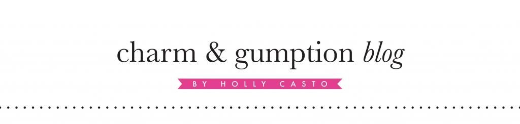
Last night, I changed my logo for Charm & Gumption. The original logo was bothering me because it didn't look great in one color, I didn't like the spacing, and it felt too bold having such a long name in all capital letters. I really like the new font and all lowercase logo - what do you think? I'm also working on creating a new logo mark that is more unique and appropriate for the brand. Right now, it's just an ampersand in a circle, but I think it could be much stronger. Stay tuned!

It is nice changing and i personally think that with the passage of time we should change our logos to make them as charm as we can. Your editing logo is amazing one and very eye-catching as well and at the end of the logo you added some text which is good for readers that they can easily judge about your work.
ReplyDelete